


Project Overview
Our objective here is to redesign the interface of Prado Health to create a desirable human-centered experience. The Prado Health app is a convenient way for patients to schedule medical appointments with physicians & for physicians to connect with their patients in a professional manner to keep up with their progress.
Role
UX Researcher
UX/UI Designer
Tools
Figma
Miro
Google Forms
Time
3 weeks
Design Process

Problem Statement
How might we create a redesign that is not only aesthetic to our patients, but is also efficient to help them navigate & book appointments at the tip of their finger?
-
There is hardly any visual hierarchy in text.
-
No onboarding screens included to educate the user about the functions & benefits of the app.
-
Very plain, not aesthetically pleasing to the eye.


User Research
Research was conducted using surveys made with google forms to see what users thoughts, feelings, and pain points were while navigating Prado Health's original design.
Goals
-
Determine how our patients would expect to navigate the app
-
Understand how redesigning with better UI can provide our patients with better UX
-
Gauge the level of convenience our patients feel using our app
Method
-
6 participants
-
Surveys via Google Forms
-
In-person interviews
Research Data
The questions asked were based on people's interaction with the booking process and their overall navigation of the app.


Insights
A majority of our users voted towards an opposing view of the original design and provided great feedback into what they would like to see more of if we were to redesign it for a more consumer-approved product.
Suggestions:
-
AM/PM feature for appointments
-
A "cancel" option along with the "edit appointment" option
-
A more identified messaging system between the patients and their physician.
Affinity Mapping
We used affinity mapping to categorize all of our notes from the in-person interviews. By using this UX research method we collaboratively sorted the information to find key takeaways.
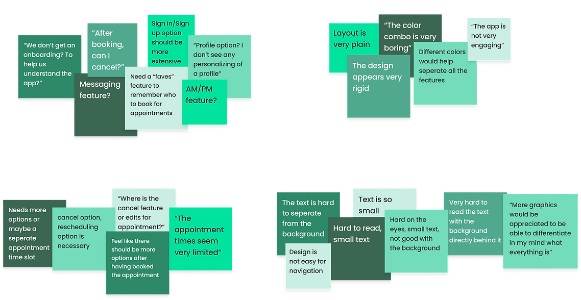
Discovery
During our interviews, I discovered a pattern amongst the group of users when it came down to booking an appointment. The users wanted total control over the booking process. They wanted to be able to cancel or edit, choose a physician, save preferences, etc.
.png)
User Personas
After collecting feedback from our participants, two different user personas were created to represent needs and goals of people looking to take care of their health & have the access to do so at their fingertips.
Meet Dane Lloyd

Meet Jane Lawson

Empathy Map
With the evaluation of our user personas, we identify the adequate journey that we believe will turn out from an effective redesign.

User Flow
Beginning the ideation process with the desired user flow helps us to build the wireframe of our design in later stages.

Sketches &
Wireframing
The user research, data, and persona evaluations help us put the pedal to the metal, alas, the wireframes are born.
Our low-fidelity sketches begin with paper & pencil.
Sign In/Sign Up to Homepage

Scheduling the Appointment

Mid-fidelity wireframes are iterated based on feedback we received from our survey takers.


AM/PM features were added in to help select times for appointments. Rounded corners were also added throughout our design to make it easier on the eyes. These additions were made to the design based on feedback that stood out from user testing.
80%
more than 80% of users voted that their first impression of the app was less than enjoyable.
more than 80% of users had difficulty navigating the app.
more than 80% of users did not have a pleasant booking experience after finalizing said booking.
Original

New Layout

Style Guide
The rounded font and layout is easier on the eyes for users which was our 'why' behind choosing this route. The green color scheme is suppose to give our users a safe & comfortable feeling, while also inspiring feelings of harmony & positivity.


Hi-fi wireframes were iterated using the style guide created.


Usability Testing
Per our usability testing feedback, we added features that the original design was lacking. These features were all suggestions from users.
AM/PM Selection Feature


Cancellation Feature


Direct Messaging


Next Steps
From our research & iterations, to now the final prototype, I plan on doing further testing with patients using Prado Health to validate the design & all of its intricacies.
Moving forward, there are other features I plan to experiment the validity of in our app such as:
-
A built-in pharmacy connected to the app
-
Chat bot feature for 24/7 assistance
-
Video call/Online appointment
Takeaways
Working on redesigning Prado Health was such a wonderful experience for me. Getting to survey real patients who want a better experience and a convenient way to schedule medical appointments taught me a lot about the scheduling process.
HOW do they expect the process to go?
WHAT features do they find essential when making an appointment?
WHY are certain features non-negotiables to our users?
How my design can positively impact what a person might be feeling, thinking, & experiencing overall is the MAIN reason I love product design.
Other Projects

Website redesign for a Houston Artist


Mississippi Dept. of Employment Security
.png)
.png)