


Project Overview
My team & I decided to dig deeper into our redesign of a traditional unemployment website.
After much research on many government sites, we decided to focus on Veteran's Services because it was very obvious that they were being overlooked.
The Goal:
Redesign the MDES website to add features that would simplify the process for veterans to find jobs after their career change & provide the proper education & tools to help reinstate them back into the work force.
Our veteran's put our country first, now it is time we put them first.
Role
UX Researcher
UX/UI Designer
Tools
Figma
Miro
Google Forms
Canva
Time
5 weeks
Design Process

User Research
Research was conducted to see what users thoughts, feelings, and pain points were while navigating the MDES website.
Goals
-
Determine what veteran users expect when searching for employment and career change opportunities
-
Understand how our redesign can help them find the tools they need to become employed
-
Gauge how likely users are to find the desired tools with ease and in a convenient amount of time for them
Method
-
4 participants
-
Surveys via Google Forms
-
Interviews conducted in-person and over Zoom
Insights
Feedback from our interviewees helped us identify that the amount of time that it takes to complete a task on the website could be a hindrance to our users.
.png)
Affinity Mapping
We created sticky notes for each data point & collaboratively sorted the information into categories we would study further to later implement into the redesign, along with categories of paint points to fix for our users.

Affinity Mapping
We created sticky notes for each data point & collaboratively sorted the information into categories we would study further to later implement into the redesign, along with categories of paint points to fix for our users.
Discovery
In our interviews, we discovered that the amount of time users were taking to find what they were looking for on the MDES website was taking longer than they were comfortable with. We focused on how might we ideate the right solution to the right problems.

Design Strategy Metrics
We plan to measure the success of our design strategy with the following metrics:
-
Did the number of clicks on veterans resources increase or decrease after the redesign was implemented?
-
Did the bounce rate for visitors accessing the veterans resources increase or decrease once the redesign was implemented?
-
Did search queries related to veterans services increase or decrease after the redesign was implemented?
By optimizing the redesign of the navigation experience, users will be able to quickly find and use our services. We focus on user retention rather than just page views because our primary purpose is to support veterans who are seeking employment. Our aim is that veterans/users come back to the site to fully utilize features like resume review; ideally, they should be returning fairly frequently for tips on their resume, job applications, etc.
User Persona & Journey Map
After collecting feedback from participants and conducting further research, our user persona was born! Zachary was created to represent needs and goals of veterans looking to enter back into the workforce for a career change.
.png)
I put together this journey map to help identify the areas that presented opportunity for adjustments and improvements.
.png)
Task Analysis & User Flow
User flows were used to determine what tasks may be required to complete a goal.
.png)

Sitemap
The following sitemap was created to outline the hierarchy of the veteran services portion of the redesign. This helped us visualize the organization of the content we're adding to provide additional resources to our veteran users.
.png)
Sketches, Wireframes, & Prototypes
The designing process begins with a few sketched out low-fidelity wireframes.
Homepage

Find Additional Services
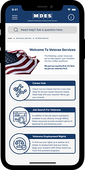
Find Veteran Services
Find Career Hub
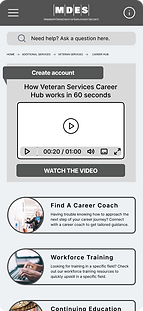
Career Hub Homepage
Create Account to use Career Hub


We also created low-fidelity sketches of what we visualized our desktop view would look like.
Homepage

Career Hub

Veteran Services

Create Account

A/B Testing
Mid-fidelity wireframes were later iterated from their original sketches using Figma. Designs were iterated further based on participant's A/B Testing results & feedback.


-
81% of testers preferred navigating to Veterans Services via “Additional Services” on the desktop version.
-
75% of testers preferred navigating to Veterans Services via “Additional Services” on the mobile version.
Desktop Version


Mobile Version


Mid-fidelity wireframes of our mobile & desktop version were also made after evaluating different Gestalt and Design principles that could be used to create an aesthetically pleasing experience as well. Here we implemented principles such as repetition, movement, & emphasis.
.png)


.png)
.png)
.png)
Homepage
Find Additional Services
Find Veteran Services
Find Career Hub
Career Hub Homepage
Create Account to use Career Hub
Homepage
.png)
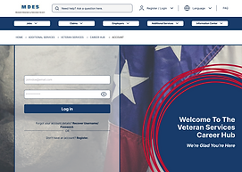
Veteran Services
.png)
Create Account

Career Hub
.png)


Style Guide
After conducting more research for our style guide, we chose the typography and color palette that would best support the voice & tone of the site: welcoming, informative, and user friendly. And of course, a high accessibility rating regarding WCAG & ADA Compliance guidelines.


Easy on the eyes,
Consistency in design,
Simple navigability.


.png)
.png)
Next Steps
.png)
.png)
.png)
Moving forward, I would like to test this product's usability with a larger amount of veteran users to determine the success of the redesign.
-
what was their impression of the site?
-
was the information on the site organized, informative, & easy to find?
-
what was the user retention rate for the Veteran Resources Career Hub?
By connecting with real veterans looking to enter back into the workforce, I will have a better understanding of how our veteran users feel after navigating the redesign, signing up for Career Hub, and gaining access to career coaching and education. This will provide excellent feedback for further improvements on iterations.
The goal is to make the lives of people having to deal with the aftermath of unemployment and career changes a bit easier. We can do that by having our redesign be a part of the solution.
Takeaways
I thoroughly enjoyed having the opportunity to redesign this unemployment website for the benefit of REAL people. I really got to empathize through the entire process, and understand how it is that we can unintentionally leave groups of people behind in the way we design products if we don't do the proper research.
I love helping people, so empathizing to create efficient, human-centered designs comes naturally to me. Empathy was the key to this particular veteran-focused redesign. I would love to see this implemented throughout all state unemployment websites!
Other Projects

Website redesign for a Houston Artist


Mississippi Dept. of Employment Security
.png)
.png)